


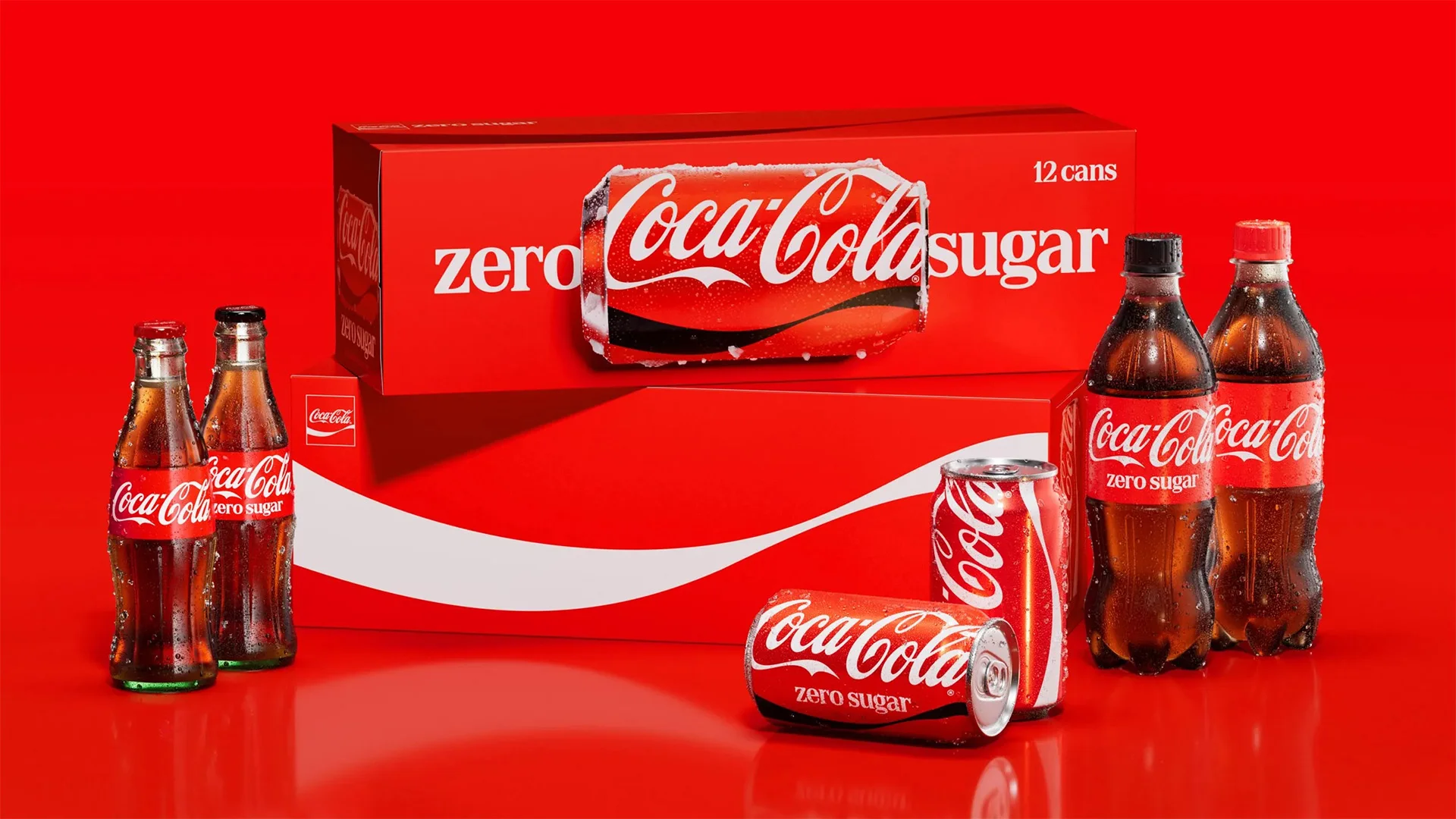
The most interesting thing from Coca-Cola’s July 20 brand identity update isn’t visual. The company’s 2026 brand refresh arrives with no new logo. The red stays the same red. The font is the same, classic script. What actually launched is a set of rules for how the most recognizable brand on earth shows up across more than 200 markets. More tellingly, it built the infrastructure that keeps those rules alive and in practice after the launch coverage fades.
The refresh – JKR on global identity, The Superultrarare on packaging, Brody Associates on typography – introduces no new assets. It amplifies the red-and-white palette, the Dynamic Ribbon, the Arden Square, and the Spencerian script. But it ships with governance infrastructure: a centralized Brand Center and AI-assisted Design Intelligence tools that Coca-Cola built with Adobe to check new work against the standard. The rollout starts across Latin America, Europe, the Middle East, and Asia, with North America to follow in 2027.
That’s the announcement. The deeper story is what the move says about where identity work is heading.
What actually changed in Coca-Cola’s 2026 visual identity system?
The visible changes are quiet ones, per Dieline’s reporting:
- Cans: the wordmark turns vertical again.
- Multipacks: the wordmark extends across the box – creating a way to photograph a can on its side. The Dynamic Ribbon gets a full panel of its own.
- Zero Sugar: a white logo and an enlarged serif “Zero Sugar,” keeping the black cap and black ribbon so it reads as family without impersonating the flagship.
- The Arden Square: the framed logo device Lippincott & Margulies designed in 1969 returns as a working asset instead of an archive piece.
- Photography: new standards from Guy Aroch, Anna Palma, and Martin Wonnacott.
None of it is dramatic, and that’s deliberate. The company’s standards state that every execution should look and feel “unmistakably Coca-Cola.” Rapha Abreu, Coca-Cola’s global vice president of design, has described the guiding idea as making the brand more itself. That means doubling down on the assets people already recognize and trust – rather than inventing new ones for them to learn.
Restraint at this scale is harder than it looks. Every stakeholder in a program this size arrives with a reason to add something. A new gradient for the campaign, a new lockup for the region, a new face for the platform. A new system with nothing new means someone spent a year saying no – with the confidence and authority to make it stick.

How big brands drift: one campaign toolkit at a time
Here’s the origin story. JKR creative director Dave Balsamello told Dieline the original brief called for a platform identity for a single campaign. “Pretty quickly, we all realized there was something bigger to solve,” he said. Nearly a decade had passed since Coca-Cola set brand-wide standards, and the guidance in between had accumulated, one campaign toolkit at a time.
That’s how big brands actually drift. Not through one bad redesign, but through years of campaigns that each bend the brand a few degrees. Every toolkit references the one before it. Ten toolkits later, a designer sits with six of them open, trying to work out which red is the red.
The mechanics of brand drift are mundane, which is why nobody catches them early on:
A campaign needs a display typeface the guidelines don’t cover, so someone commissions one.
The next campaign inherits it because the files sat in the shared drive and the deadline is close.
Two campaigns later, three markets treat it as the brand font.
But nobody actually decided that.


The same pattern runs through color builds, logo clearances, motion behaviors, photography treatments. Every gap in the standard becomes an invitation for a well-meaning team to fill it locally, and every local fill becomes a new precedent.
Production partners tend to feel this before anyone else, because we work downstream. We live in the spaces where identity systems succeed or fail: the color suite, the edit bay, the load-in. When teams face deadlines, volume demands, and scaling pressure, small shortcuts and manual workarounds create unintentional inconsistencies, turning cohesive strategies into fragmented noise. By the time the inconsistency reaches the finished work, usually the people producing it have been improvising for a while.
And at a company running 200-plus markets through a rotating roster of agencies and production partners, improvisation scales fast. Every partner interprets, every interpretation ships, and every shipped interpretation becomes someone else’s reference file.
Brand governance is the product, not the look
Two things launched alongside the refreshed system, and they’re the real value story. The Brand Center gives the whole brand a single home – core assets, visual principles, and standards spanning packaging, retail environments, equipment, and fleet – built for internal teams and agency partners alike. Design Intelligence, a set of AI tools Coca-Cola developed with Adobe and trained on its own archives, checks new work against the standard as teams create it.
Most identity programs end at a guidelines PDF, and the drift resumes the following Monday. Coca-Cola treated the reference-and-verification layer as a launch deliverable, which quietly reframes what an identity engagement produces. The look is the easy half; the machine that keeps the look is the work.
It’s also worth noticing where the AI sits. It isn’t generating the creative – it’s checking it. Craft stays with people; the system automates the compliance check. That’s the reverse of how most organizations first reach for these tools (we traced a version of the same placement question in FOOH advertising’s AI disclosure era).
The default corporate instinct points generative AI at volume: more variants, more formats, faster. But volume was never a challenge for Coca-Cola. A brand at this scale can make plenty of things; what it struggles to make is the same thing, everywhere, every time. Pointing the AI at coherence instead of output is the more sophisticated read of what the technology is actually for – and it’s the arrangement that protects a brand instead of diluting one.

There’s a practical dividend here that anyone waiting on brand approvals will recognize. When the standard lives in one place and a tool can check against it, “is this on brand” stops being a two-week email chain and becomes a same-day answer. Subjective arguments – that red looks off, that spacing feels wrong – become reference checks. For the partners making the work, a strict, responsive source of truth beats a loose one that adjudicates slowly, every time.
The shift, side by side:
| The guidelines model | The governance model | |
|---|---|---|
| Version of record | A PDF, plus every campaign toolkit since | One Brand Center |
| “Is this on brand?” | An email chain, answered in weeks | A reference check, answered same-day |
| Where the AI points | At volume – more variants, faster | At coherence – checking work against the standard |
| Between campaigns | Drift resumes Monday | The system keeps running |
| What the engagement produces | A look | A look, plus the machine that keeps it |
One caution from the production side: an enforcement machine is only as good as the standard it enforces. And every enforcement system needs a court of appeals. There are moments on real projects when the rule should bend – a grade pushed for a director’s intent, a lockup broken for a format the guidelines never imagined. The test of Coca-Cola’s system won’t just be how well it catches deviations. It will be whether a real person with taste, knowledge, and authority sits above the tool – able to say: in this case, the exception is right.
From “One Brand” to “Real Magic”: restraint has a history
The 2026 visual system reads less like a pivot than it does the third act of a long arc. Industry coverage of the past decade records Coca-Cola consolidating its portfolio under a “One Brand” strategy in the mid-2010s, with Turner Duckworth’s red-disc packaging pulling the trademark family into a single, distinct visual logic. The 2021 “Real Magic” platform then flexed the wordmark itself with the “Hug” logo.
In sequence, the moves outline the brand strategy: consolidate the portfolio, then the expression, then the governance. Each step trades novelty for cohesion and consistency. The 2026 refresh doesn’t reverse the previous decade – it builds the enforcement needed to lock it in.
The hardest test: brand identity in motion
The announced scope of the system reads static and physical: packaging, retail environments, equipment, fleet. The surface the coverage barely touches is the one where, in our experience, an identity system takes its hardest hits – motion. A brand this size lives on screens more hours a day than it lives on shelves: broadcast spots, social cutdowns, event LED walls, stadium boards, in-store displays. Every one of those surfaces asks questions a print-first guideline can’t answer. How does the Spencerian script animate on and off? What does the Dynamic Ribbon do at 24 frames per second – does it move, and if so, with what physics? And the literal version of this piece’s headline question: which red is the red when the same artwork travels from a Pantone-matched can to a Rec.709 broadcast grade to an LED wall whose calibration belongs to the venue, not the brand?
We’ve sat in the color suites when a colorist answers those questions, usually at 11 p.m. against a delivery deadline, usually with a judgment call the guidelines never anticipated. Multiply that call across 200 markets and hundreds of production partners, and motion becomes the fastest drift risk a brand has. It moves faster than packaging, because a box or a can clears approval once, while a campaign lives through cutting, versioning, and re-grading for its entire run.

Live application
Live environments push the problem further still. At an event, the brand doesn’t appear as a file; it appears as lighting design, stage material, a screen that a broadcast camera will re-photograph and re-grade on the way to another audience. The LED wall that reads perfectly in the room can moiré or shift on camera.
The venue owns the calibration; the broadcaster owns the transmission chain; the brand owns neither. No brand center answers those questions at 6 p.m. on load-in day. Producers answer them in pre-production, by locking and distributing references before the trucks arrive. That’s exactly why an identity system that wants to hold in the physical world has to reach production partners early, not audit them late.
Coca Cola’s Design Intelligence layer is worth watching past launch day. Checking a static file against a standard is a solved problem; but checking a grade, an animation curve, or the brand’s behavior on a live stage is not. Whether Coca-Cola extends its version of record into motion and live environments will decide whether the governance holds where the brand actually spends its time. Think animation standards for the ribbon, grade references per delivery spec, calibration targets for event screens. The identity systems we trust on set answer those questions before anyone has to ask.
What to demand from your next rebrand
If the machinery is the deliverable, the way companies brief, budget, and measure identity work should change with it. Three shifts follow from taking Coca-Cola’s move seriously.
Most identity briefs describe a reveal: the new look, the launch film, the case study. Almost none describe year two: who answers the everyday questions, where the version of record lives, how a new campaign toolkit gets checked back against the system. Coca-Cola wrote the maintenance into the launch. Any brand commissioning identity work can demand the same: guidelines are a snapshot; ask what keeps them true.
A governance layer costs money after the launch coverage fades – tooling, staffing, the support desk. That spend is invisible in a case study and decisive in practice. The honest comparison isn’t governance versus no cost; it’s governance versus the cost of what happens when every partner assumes their own version of your brand standards.
Launch metrics flatter every identity program. The metrics that predict the system’s durability are duller: how fast a market gets an answer, how many deviations surface per quarter, how many campaign toolkits fork versus inherit. A brand that tracks those numbers knows more about its identity’s health – and understands their brand well beyond its launch story.
Brand consistency at scale – without the 200 markets
The principle scales down even if the tooling doesn’t. Identity work doesn’t end when the look wins approval; it ends when the system that answers everyday questions is up and running. Four of those questions are worth asking about your own brand now:
If the honest answer is a pile of campaign toolkits, you don’t have a version of record – you have competing ones. The drift has already started; it just hasn’t surfaced in the finished work yet.
A campaign should express the identity, not temporarily replace it.
If the guidelines stop at logo, color, and type – no motion behavior, no grade reference, no screen standards – then every video project re-invents the brand’s physics from scratch, and every reinvention drifts.
Coca-Cola could have coasted on recognition longer than almost any brand alive. Instead it spent the year building the machinery most companies skip, then made the machinery part of the announcement. That’s the lesson worth carrying out of this one: the brands that look effortless at scale run the most deliberate systems underneath.
Thinking about your brand’s version of record? Brand identity fragmentation is a solvable production problem. Tell us what you’re building.
